Before learning the position property, it helps to understand block/in-line behaviors, box model, and normal flow.
The position property accepts five values: static, relative, fixed, absolute, and sticky. Static is the default value and it positions the element where it would normally sit on the page.
The next three values are described below.
The relative, fixed, and absolute properties can be used hand-in-hand with the top, right, bottom, left, and z-index properties to get your elements where you want them. First you define the type of position (relative, fixed, or absolute), then you move it where you want it horizontally or vertically using the top, right, bottom, and left properties. And if you want that element to be underneath or on top of a different element, you can use z-index for that third dimension position.
The Relative Value
An element with position: relative will be positioned relative to it’s normal place in the flow of the document. So, if you don’t move it with a top, right, bottom, or left property, then position: relative is the same as position: static, the default or normal positioning of an element.
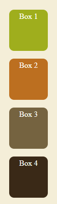
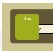
The boxes in Fig. 1 are all static elements (not positioned). They are just divs with some background color and a little styling. Because divs are block elements, they stack on top of each other. If you added display: inline to the div styling, they would line up side-by-side. But that’s another tutorial.
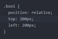
If we add position: relative and top: 200px and left: 200px the box will move 200px down from the top of where it normally would sit, and 200px from the left side of where it normally sits, as shown in Fig. 2.
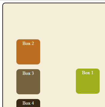
Besides the fact that Box 1 moved, notice how the other boxes didn’t move up to fill its gap. This is one of the qualities of relative positioning.
The Fixed Value
If you style an element with position: fixed, three things happen. (1) The element becomes positioned relative to the viewport. (2) The place where the element would be – i.e. it’s place in the normal flow of the document with no positioning – gets filled up with the next elements in the flow. In other words, there is no gap left where the fixed element used to be. (3) The fixed element stays exactly where you position it, even through scrolling. So, if you add position: fixed bottom: 5px and right: 5px to the css for that element, it will be positioned on the bottom, right corner of the viewer’s screen, 5 pixels from the edge, and it will stay there while the rest of the page scrolls up or down.
Fixed positioning is useful if you want an element, a navigation menu, for example, to stay visible to the user as they scroll. It’s not good, though, to use it to stick ads and pop-ups on the screen that cover up what’s underneath. These tactics are known as dark patterns, and they are the opposite of good UX.
If you want to see how fixed positioning works, check out this pen on codepen.
The Absolute Value
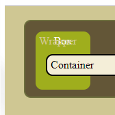
An element styled with position: absolute is positioned relative to its nearest positioned parent element. This means that if there were a number of nested divs, like this:
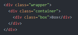
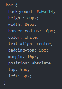
and we added position: absolute to the .box selector and then moved it with the top, right, bottom and/or left properties, it would move relative to the perimeter of the container box, if the .container selector was styled with a position other than static.
If .container had no position property set, but .wrapper did, then the “Box” box would move relative to the perimeter of the wrapper box. If neither the wrapper nor the container elements were styled with a position property, then the box with absolute positioning would be positioned relative to the body element.
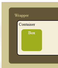
For example, if we add position: relative to .wrapper, and position: absolute to .box (see below left), and then we add top and left properties to .box, the box would move like this:

Note that .wrapper is positioned (styled with the position property, and not static) but .container is not, so when position: absolute is applied to .box, that element (div) becomes positioned relative to the wrapper, not the container.
Also note that when “Box” is moved, there is no gap where it used to be, shown by the container squishing in height.
The remaining value for the positionproperty is sticky. I haven’t found any use for sticky positioning. If you want to learn about position: sticky you might want to watch a YouTube video.
The Z-Index Property
In addition to using top, right, bottom, and left to move an element horizontally and vertically on a page, you can use z-index to move it a third dimension. Adding z-index to your css puts the element above or below other elements that may be overlapping due to positioning. It’s like you are moving the element toward and away from the viewer.
Mathematically, if you imagine left and right move an element horizontally along an x axis, and top and bottom move an element vertically along a y axis, a higher z-index moves an element toward the user along a z axis. A lower z index moves it away from the user.
So, in the example above, if we added z-index: -5 to the .wrapper selector, and z-index: -1 to .box, the box would be above the wrapper but underneath the container, like this.
As a real world example, I was looking at a snow animation, and the developer used position: fixed and z-index: 300 on her .snow selector. In this way, she was able to add animation transformations which made the snow fall on the page seemingly on top of the other elements. It looked great!